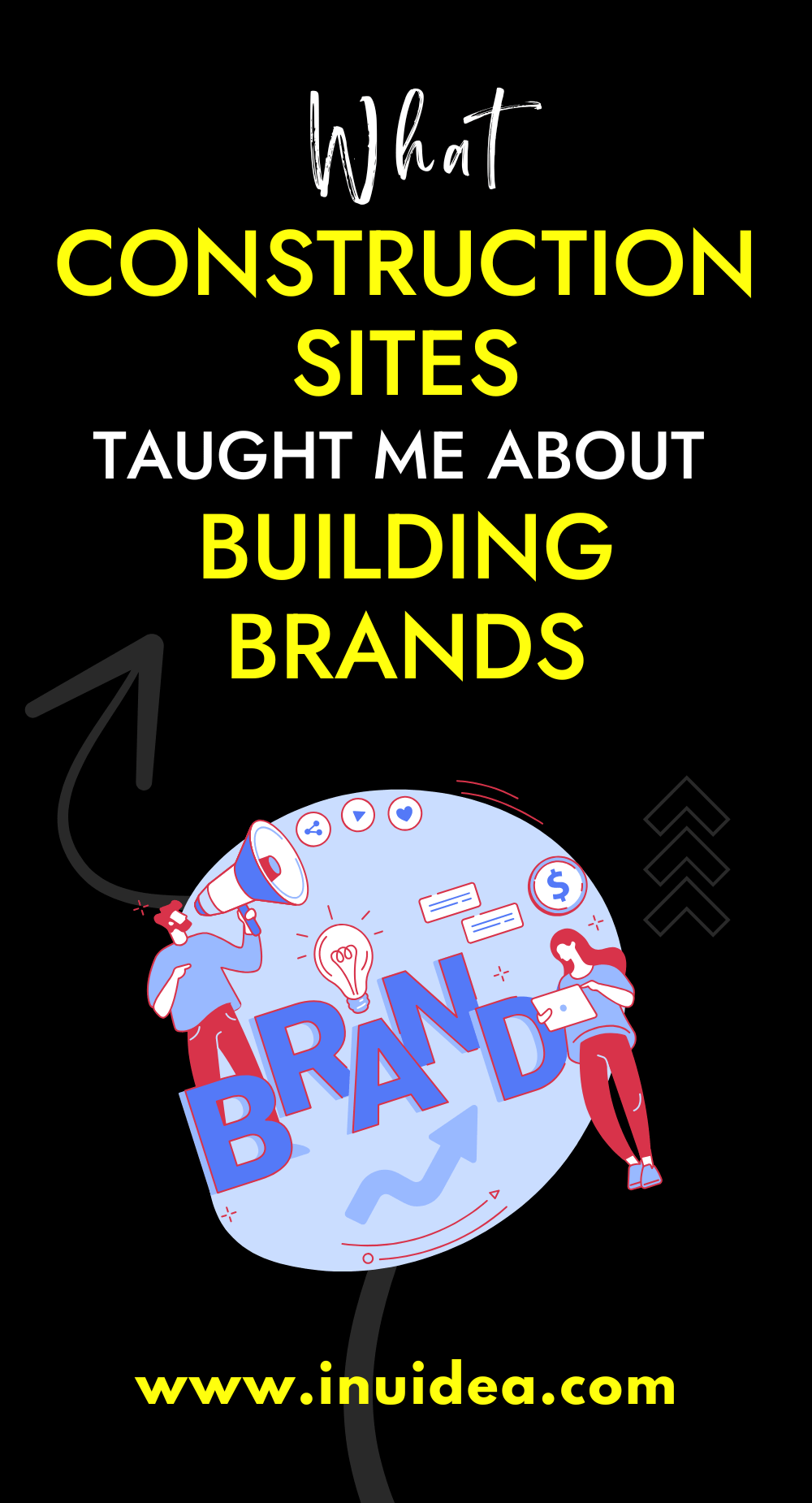
Stand beside any urban construction site for five minutes, and you’ll hear grinders, spot cranes, and feel the earth rumble. Strangely, that mix of grit and chaos mirrors what it’s like behind the scenes of brand-building. Both start from nothing but an idea and a plot, whether physical or digital, and both will collapse if the foundation is shaky. When I set out to shape my agency’s image, I didn’t lean on marketing manuals. I borrowed straight from construction sites. The result? A presence that still stands firm, even as shifts in the market take down less prepared contenders.
Foundation First
An architect doesn’t pour concrete until the surveyor signs off on the soil. Brand architects, you included, should do the same. Before getting swept up in logos, color palettes, or clever taglines, ask yourself what your business actually needs to withstand. Revenue forecasts, promises to your customers, your company culture, it all matters. I mapped mine using a simple three-column grid: Purpose, Proof, and Payoff. It wasn’t fast work, but it forced me to define exactly who I serve and why it counts. That clarity became the rebar holding every campaign in place years later.
Frequent Checks
Even the glossiest high-rise needs regular check-ins. Bolts loosen, weather shifts and compliance rules get updated. Your brand weathers similar pressure through competitor moves, algorithm changes, and customer mood swings. Once every quarter, I budget time for a personal “sidewalk.” I reread the web copy, scanned social feedback, and listened to two full sales calls from different team members. It’s not about fixing everything.
Repair Before You Grow
Startup founders often chase new floor products, audiences, or exciting collaborations. But none of that works if the base is already creaking. When analytics flagged a drop in repeat customers last year, I hit pause on expansion plans and focused on the leak. The fix wasn’t flashy; I updated onboarding emails. Still, retention rebounded within weeks. That moment reminded me why contractors prioritize commercial concrete repair before adding new levels, because what’s underneath always carries the weight of what comes next.
Finishing Touches
Once you’re sure the structure holds, polish becomes an expression, not a distraction. Fonts, visuals, and tiny animations elevate user experience just like stone facades elevate an entryway. But subtlety wins. I pick one design accent, sound, motion, or material, and let it whisper refinement instead of screaming for attention. Think: brass handles on a bare concrete wall. Customers might not consciously name it, but they sense the intent, and that quiet professionalism nudges them closer to trusting the brand.
Takeaway Checklist
Here’s the same cheat sheet I hand new founders who ask how to “look solid” without wasting money. Stick it above your desk. Treat every step like a quality inspector tapping the beam.
- Soil Test: Define purpose, proof, and payoff before spending a dollar on design.
- Blueprint Lock-In: Record your tone, visuals, and messages so outside help doesn’t reinvent them.
- Quarterly Walkthrough: Reassess content and feedback with a fresh lens and get input from someone who isn’t inside your team.
- Patch, Then Grow: Handle churn, confusion, or reputation dips first. New features can wait.
- Elegant Trim: Choose one signature detail and let it carry your brand’s quality cue.
Stick to those five steps, and your brand won’t just look sturdy. It’ll be built to stay that way, no matter what the market throws your way.
Thanks for reading this article. 💚
If you loved what you read, would you be able to buy me a cup of coffee? It’s okay if you can’t right now.
If you have any questions or if you wanna work with me, feel free to contact me. I’m always available to help young hustlers like you @InuEtc on Instagram.
Keep hustling!
Leave A Comment